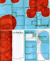
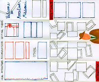
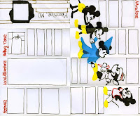
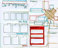
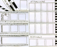
I believe my best thumbnails were for the Marceline, MO pamphlet. Each mini, dummy-pamphlet shows a completely different concept. One explores the idea of Walt Disney going on to be world renowned for his movies and uses film strips as a motif. Another shows very little homage to Disney and emphasizes Marceline as a small-town, tourist attraction, providing a large map on the inside spread with each attraction pointed out and explained. One of my favorites shows an evolution of Mickey Mouse and a baseboard with a mouse hole on the front cover. The idea behind this design was to show that Disney grew up and matured out of Marceline, like Mickey Mouse grows and evolves over time. Another has a tourist theme, making all the photographs of the town's sights into postcards with the intention of drawing visitors. The fifth, and the design that was carried further into production, is the most colorful and uses a Mickey Mouse ears motif throughout. Although it was difficult at first to think up 5 completely different concepts and ideas, I think that each one could be carried out successfully.
Best Marker Comp
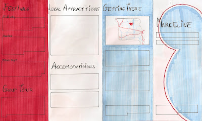
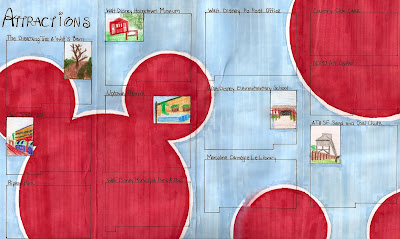
I believe my best marker comp was for the Marceline, MO pamphlet. I believe this shows successful copyfitting, design decisions, and is clean and neat. The first thing I did was copy-fit each paragraph of copy and cut out pieces of paper the correct size to trace onto the comp. This helped me arrange the paragraphs so they would fit in the layout and have a relatively uniform look. This process of making a marker comp forced me to make many design decisions ahead of time. For example, I had to decide what I wanted to do with subheads, how to arrange the paragraphs of copy, what images to use, etc. Also, I made smaller decisions about what size the margins should be, how big to make the gutter between the columns, and so on. By taking the time to make these decisions and carefully marking them out now, the final production of the pamphlet was completed quickly and successfully.
Best Traditional Copyfitting

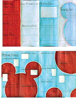

It took awhile to get the hang of copyfitting at first. But eventually, I think I began to understand it more, making the process a little easier. The most successful copyfitting I did was for the Marceline pamphlet. At first I had some difficulties because I knew I wanted the copy for the Attractions to wrap around photographs. As we had not discussed how to do this in class, I experimented a little. Although some paragraphs are a little off, overall, my method was pretty successful. I was very glad that I did use traditional copyfitting, as it showed me how to arrange the paragraphs so that the inside spread would seem pretty uniform while still fitting in all the copy as well as the photographs I wanted. Copyfitting for the outside panel was a little more difficult because I knew the copy wasn't in paragraph form, but in lines. So I copyfit based on the number of lines instead of characters. Although this did not give a feel for how long each line would be, it did give a general idea of how long each list would be. Although the process was painstakingly tedious, I am glad that I went through it because I think it helped solve many problems that could have come up later and the layout is better overall as a result.
Best Design
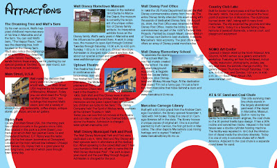
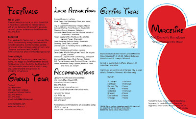
I believe my best design was for the Marceline, MO pamphlet. It shows a sense of hierarchy through the use of different text sizes and typefaces. For example, the headers -- telling the reader what the information he or she is about to read is concerning -- are a larger size and in the Waltograph typeface. Meanwhile, to show less importance and for the sake of legibility, the rest of the copy is in simple Helvetica. I distinguished the subheads, making them bold. This project is unified by using the same typefaces and styles throughout as well as keeping the same color scheme of red, white and blue. I chose this color scheme to give a sense of a patriotic small town. I also unified the piece by using the same Mickey Mouse motif throughout, although with some variations to add interest. A grid structure keeps it organized and legible. Overall, my target audience was young families with children. I believe that this fun, colorful layout would be successful in attracting such an audience and enticing them to visit the small town of Marceline, MO; hometown of Walt Disney.
Best Typography
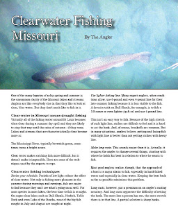
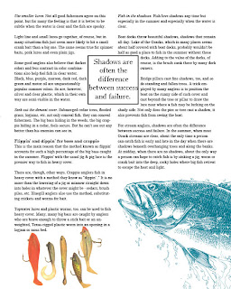
My best use of typography comes from the project which, ironically, was one of the easiest to set: the fishing magazine spread. In this spread I believe I successfully implemented a headline, byline, headers, subheads, and a pull quote. With a photograph behind the header and byline, I had to make sure that they were legible. I made the header text white with a black stroke to add emphasis and increase readability and added a drop shadow to add depth and definition between the text and background photo. I used simple black text for the byline so that it is readable but definitely less important and prominent than the header. Also, I positioned the text in a neutral area of the photograph so that the header and photo would not distract from each other. In addition, I payed careful attention to insure there were no widows or orphans in the body copy. I used a similar typeface as that of the header and byline to create unity but chose one with slightly easier readability for the larger blocks of copy. To distinguish headers from subheads, I made the headers bold while making the subheads italicized, never using both at the same time. I used text wrap around the pull quote and made sure that the images on the second page of the spread did not overlap and hide the text.
Best Concept
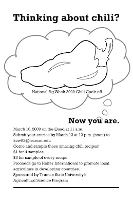
This project, a promotional poster for the National Ag Week 2009 Chili Cook-off was fun to think of ideas and concepts for. My goal was to create a poster that was interesting, with a concept that was a little different and made the viewer think. The idea behind the poster was to get people to enter their chili recipes for the cook-off. Now, most college students I know aren't usually thinking about cooking chili, chili cooking contests, or National Ag Week. So my task was to make them start thinking about it in the few seconds that they might glance at this poster. After playing around with several other concepts, I decided that the simplest way was the most obvious. Thus, the header "Thinking about chili?" to which the answer would of course be "No." But after being asked the question, the passerby then cannot help but be thinking about chili: "Now you are." In addition to meeting the goal of getting the viewer to consider chili, I think this concept comes across as slightly witty, or at least slightly entertaining. To further the idea of the viewer contemplating chili, I started the thought bubble at the word "you," emphasizing that is is the viewer's thought of chili and the National Ag Week 2009 Chili Cook-off that we are seeing, adding a personal aspect. Using a simple graphic of a chili pepper instead of a bowl of chili also helps with the straightforward, obvious approach I decided to take with this project.

No comments:
Post a Comment