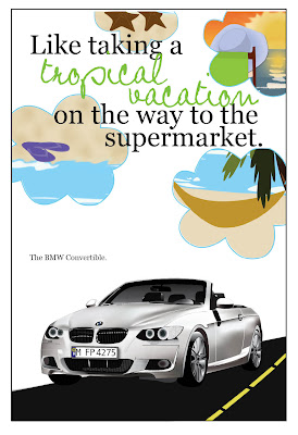
This piece, my Ride Promotional Poster shows proficiency in both Illustrator and Photoshop. Most elements of this layout were created in Illustrator. The car itself was a separate project, that was then integrated into this one. The car was built in Illustrator, taking lots of time but in the end, looking pretty good. For this project, I used many Illustrator tools including the pen tool, gradients, gradient meshes, and transparencies. Besides building the car in Illustrator, I built the tropical, beach images in the clouds to further the feeling of a tropical vacation. I think these tiny images are successful in this. Although the images are not as realistic as a photograph, they give an idealized picture of the beach, tropical getaways, and relaxation, which is their purpose. I used several tools in Illustrator to build them. Primarily, I used the pen tool to draw all the shapes I could, including shadows, highlights, etc. I also utilized the layers to keep them organized and to prevent me from getting confused.
The final cloud images were assembled in Photoshop, however. I imported the .ai files into photoshop, where I applied several effects to make the images slightly more realistic. For example, I used the blur tool to blend the wave breaks and used the burn tool to add dimension to the sandy beaches. I used the blur tool, the smudge tool, and the clone stamp to create the sunset seen in the cloud in the top right corner. After building the outlines of the clouds in Illustrator, I imported them as well into Photoshop and used them to create clipping paths and layer masks to condense the original Illustrator graphic into the desired shape. I then added another cloud outline as another layer on top to create the outlines of the clouds for a more defined edge.
Because of the range of skills and tools used in both Illustrator and Photoshop to build these graphics, I believe they are a good representation of my proficiency in both programs.
InDesign


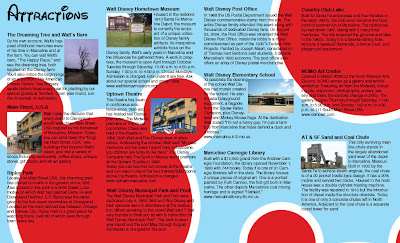
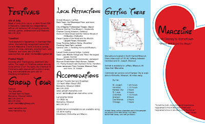
This pamphlet promoting the small town of Marceline, MO, hometown of Walt Disney, is the piece I've chosen to display my proficiency in InDesign. It successfully uses the principle tools of InDesign. First, it uses a grid system to create the four different panels. Also, each image or graphic has been built in Illustrator or prepared in Photoshop and then correctly imported into this document at the correct resolution and in the correct color mode. Another important element of InDesign is text, which I believe I used and arranged well. To make the process a little easier on myself, I used lots of character styles: one for the headers in the Waltograph typeface, one for the subheads, and one for the paragraphs of text. This made arranging and formatting the text much easier and faster. Another tool I used in this project was text wrap, which after a little adjusting and playing around with it, I think works well. Because this project required the use of the fundamental tools of InDesign, I believe it is a good example of my proficiency with this software.

No comments:
Post a Comment