As early in the morning as it was, I sincerely liked taking DSP. I think I learned more design tips and tricks in this class than any other this semester. I learned my way around programs like Illustrator, Photoshop, and InDesign and how to incorporate different elements from each into one final project. I think the program I still need the most practice with is Photoshop, working with the different effects and masks. I am eager to learn more about the program, however, and I am looking forward to the soonest opportunity to do so. I have learned to enjoy importing graphics and text into an InDesign document, making sure they are all the right resolution and color mode, checking to make sure the type follows the basic typographic rules.
But in addition to learning some of the ins and outs of Adobe software, I learned how to be a designer. I learned that just knowing how to manipulate the software doesn't mean you know how to make a good design. It is the person that makes the design, not the computer. Thus, I learned how to do much of the designing process by hand: thumbnails, internal approval, marker comps, client presentation, and copy-fitting. Of these aspects, I think I need the most improvement in coming up with creative concepts and ideas quickly in the thumbnail stage. I think that this skill improved as the semester has progressed, but I am hoping to develop this skill even more in future VisCom courses. I can't wait!
5.01.2009
4.29.2009
Final Portfolio: Design Process
Best Thumbnails
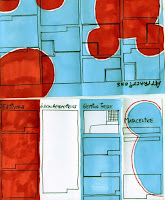
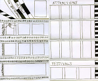
I believe my best thumbnails were for the Marceline, MO pamphlet. Each mini, dummy-pamphlet shows a completely different concept. One explores the idea of Walt Disney going on to be world renowned for his movies and uses film strips as a motif. Another shows very little homage to Disney and emphasizes Marceline as a small-town, tourist attraction, providing a large map on the inside spread with each attraction pointed out and explained. One of my favorites shows an evolution of Mickey Mouse and a baseboard with a mouse hole on the front cover. The idea behind this design was to show that Disney grew up and matured out of Marceline, like Mickey Mouse grows and evolves over time. Another has a tourist theme, making all the photographs of the town's sights into postcards with the intention of drawing visitors. The fifth, and the design that was carried further into production, is the most colorful and uses a Mickey Mouse ears motif throughout. Although it was difficult at first to think up 5 completely different concepts and ideas, I think that each one could be carried out successfully.
Best Marker Comp
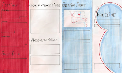
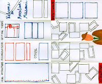
I believe my best marker comp was for the Marceline, MO pamphlet. I believe this shows successful copyfitting, design decisions, and is clean and neat. The first thing I did was copy-fit each paragraph of copy and cut out pieces of paper the correct size to trace onto the comp. This helped me arrange the paragraphs so they would fit in the layout and have a relatively uniform look. This process of making a marker comp forced me to make many design decisions ahead of time. For example, I had to decide what I wanted to do with subheads, how to arrange the paragraphs of copy, what images to use, etc. Also, I made smaller decisions about what size the margins should be, how big to make the gutter between the columns, and so on. By taking the time to make these decisions and carefully marking them out now, the final production of the pamphlet was completed quickly and successfully.
Best Traditional Copyfitting


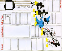
It took awhile to get the hang of copyfitting at first. But eventually, I think I began to understand it more, making the process a little easier. The most successful copyfitting I did was for the Marceline pamphlet. At first I had some difficulties because I knew I wanted the copy for the Attractions to wrap around photographs. As we had not discussed how to do this in class, I experimented a little. Although some paragraphs are a little off, overall, my method was pretty successful. I was very glad that I did use traditional copyfitting, as it showed me how to arrange the paragraphs so that the inside spread would seem pretty uniform while still fitting in all the copy as well as the photographs I wanted. Copyfitting for the outside panel was a little more difficult because I knew the copy wasn't in paragraph form, but in lines. So I copyfit based on the number of lines instead of characters. Although this did not give a feel for how long each line would be, it did give a general idea of how long each list would be. Although the process was painstakingly tedious, I am glad that I went through it because I think it helped solve many problems that could have come up later and the layout is better overall as a result.
Best Design
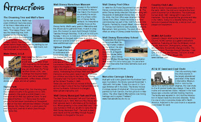

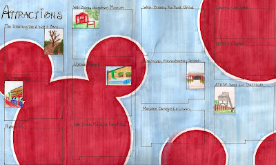
I believe my best design was for the Marceline, MO pamphlet. It shows a sense of hierarchy through the use of different text sizes and typefaces. For example, the headers -- telling the reader what the information he or she is about to read is concerning -- are a larger size and in the Waltograph typeface. Meanwhile, to show less importance and for the sake of legibility, the rest of the copy is in simple Helvetica. I distinguished the subheads, making them bold. This project is unified by using the same typefaces and styles throughout as well as keeping the same color scheme of red, white and blue. I chose this color scheme to give a sense of a patriotic small town. I also unified the piece by using the same Mickey Mouse motif throughout, although with some variations to add interest. A grid structure keeps it organized and legible. Overall, my target audience was young families with children. I believe that this fun, colorful layout would be successful in attracting such an audience and enticing them to visit the small town of Marceline, MO; hometown of Walt Disney.
Best Typography
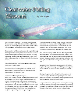
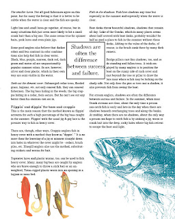
My best use of typography comes from the project which, ironically, was one of the easiest to set: the fishing magazine spread. In this spread I believe I successfully implemented a headline, byline, headers, subheads, and a pull quote. With a photograph behind the header and byline, I had to make sure that they were legible. I made the header text white with a black stroke to add emphasis and increase readability and added a drop shadow to add depth and definition between the text and background photo. I used simple black text for the byline so that it is readable but definitely less important and prominent than the header. Also, I positioned the text in a neutral area of the photograph so that the header and photo would not distract from each other. In addition, I payed careful attention to insure there were no widows or orphans in the body copy. I used a similar typeface as that of the header and byline to create unity but chose one with slightly easier readability for the larger blocks of copy. To distinguish headers from subheads, I made the headers bold while making the subheads italicized, never using both at the same time. I used text wrap around the pull quote and made sure that the images on the second page of the spread did not overlap and hide the text.
Best Concept
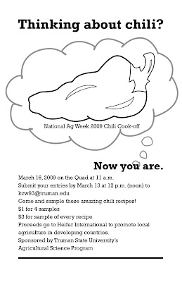
This project, a promotional poster for the National Ag Week 2009 Chili Cook-off was fun to think of ideas and concepts for. My goal was to create a poster that was interesting, with a concept that was a little different and made the viewer think. The idea behind the poster was to get people to enter their chili recipes for the cook-off. Now, most college students I know aren't usually thinking about cooking chili, chili cooking contests, or National Ag Week. So my task was to make them start thinking about it in the few seconds that they might glance at this poster. After playing around with several other concepts, I decided that the simplest way was the most obvious. Thus, the header "Thinking about chili?" to which the answer would of course be "No." But after being asked the question, the passerby then cannot help but be thinking about chili: "Now you are." In addition to meeting the goal of getting the viewer to consider chili, I think this concept comes across as slightly witty, or at least slightly entertaining. To further the idea of the viewer contemplating chili, I started the thought bubble at the word "you," emphasizing that is is the viewer's thought of chili and the National Ag Week 2009 Chili Cook-off that we are seeing, adding a personal aspect. Using a simple graphic of a chili pepper instead of a bowl of chili also helps with the straightforward, obvious approach I decided to take with this project.


I believe my best thumbnails were for the Marceline, MO pamphlet. Each mini, dummy-pamphlet shows a completely different concept. One explores the idea of Walt Disney going on to be world renowned for his movies and uses film strips as a motif. Another shows very little homage to Disney and emphasizes Marceline as a small-town, tourist attraction, providing a large map on the inside spread with each attraction pointed out and explained. One of my favorites shows an evolution of Mickey Mouse and a baseboard with a mouse hole on the front cover. The idea behind this design was to show that Disney grew up and matured out of Marceline, like Mickey Mouse grows and evolves over time. Another has a tourist theme, making all the photographs of the town's sights into postcards with the intention of drawing visitors. The fifth, and the design that was carried further into production, is the most colorful and uses a Mickey Mouse ears motif throughout. Although it was difficult at first to think up 5 completely different concepts and ideas, I think that each one could be carried out successfully.
Best Marker Comp


I believe my best marker comp was for the Marceline, MO pamphlet. I believe this shows successful copyfitting, design decisions, and is clean and neat. The first thing I did was copy-fit each paragraph of copy and cut out pieces of paper the correct size to trace onto the comp. This helped me arrange the paragraphs so they would fit in the layout and have a relatively uniform look. This process of making a marker comp forced me to make many design decisions ahead of time. For example, I had to decide what I wanted to do with subheads, how to arrange the paragraphs of copy, what images to use, etc. Also, I made smaller decisions about what size the margins should be, how big to make the gutter between the columns, and so on. By taking the time to make these decisions and carefully marking them out now, the final production of the pamphlet was completed quickly and successfully.
Best Traditional Copyfitting


It took awhile to get the hang of copyfitting at first. But eventually, I think I began to understand it more, making the process a little easier. The most successful copyfitting I did was for the Marceline pamphlet. At first I had some difficulties because I knew I wanted the copy for the Attractions to wrap around photographs. As we had not discussed how to do this in class, I experimented a little. Although some paragraphs are a little off, overall, my method was pretty successful. I was very glad that I did use traditional copyfitting, as it showed me how to arrange the paragraphs so that the inside spread would seem pretty uniform while still fitting in all the copy as well as the photographs I wanted. Copyfitting for the outside panel was a little more difficult because I knew the copy wasn't in paragraph form, but in lines. So I copyfit based on the number of lines instead of characters. Although this did not give a feel for how long each line would be, it did give a general idea of how long each list would be. Although the process was painstakingly tedious, I am glad that I went through it because I think it helped solve many problems that could have come up later and the layout is better overall as a result.
Best Design


I believe my best design was for the Marceline, MO pamphlet. It shows a sense of hierarchy through the use of different text sizes and typefaces. For example, the headers -- telling the reader what the information he or she is about to read is concerning -- are a larger size and in the Waltograph typeface. Meanwhile, to show less importance and for the sake of legibility, the rest of the copy is in simple Helvetica. I distinguished the subheads, making them bold. This project is unified by using the same typefaces and styles throughout as well as keeping the same color scheme of red, white and blue. I chose this color scheme to give a sense of a patriotic small town. I also unified the piece by using the same Mickey Mouse motif throughout, although with some variations to add interest. A grid structure keeps it organized and legible. Overall, my target audience was young families with children. I believe that this fun, colorful layout would be successful in attracting such an audience and enticing them to visit the small town of Marceline, MO; hometown of Walt Disney.
Best Typography


My best use of typography comes from the project which, ironically, was one of the easiest to set: the fishing magazine spread. In this spread I believe I successfully implemented a headline, byline, headers, subheads, and a pull quote. With a photograph behind the header and byline, I had to make sure that they were legible. I made the header text white with a black stroke to add emphasis and increase readability and added a drop shadow to add depth and definition between the text and background photo. I used simple black text for the byline so that it is readable but definitely less important and prominent than the header. Also, I positioned the text in a neutral area of the photograph so that the header and photo would not distract from each other. In addition, I payed careful attention to insure there were no widows or orphans in the body copy. I used a similar typeface as that of the header and byline to create unity but chose one with slightly easier readability for the larger blocks of copy. To distinguish headers from subheads, I made the headers bold while making the subheads italicized, never using both at the same time. I used text wrap around the pull quote and made sure that the images on the second page of the spread did not overlap and hide the text.
Best Concept

This project, a promotional poster for the National Ag Week 2009 Chili Cook-off was fun to think of ideas and concepts for. My goal was to create a poster that was interesting, with a concept that was a little different and made the viewer think. The idea behind the poster was to get people to enter their chili recipes for the cook-off. Now, most college students I know aren't usually thinking about cooking chili, chili cooking contests, or National Ag Week. So my task was to make them start thinking about it in the few seconds that they might glance at this poster. After playing around with several other concepts, I decided that the simplest way was the most obvious. Thus, the header "Thinking about chili?" to which the answer would of course be "No." But after being asked the question, the passerby then cannot help but be thinking about chili: "Now you are." In addition to meeting the goal of getting the viewer to consider chili, I think this concept comes across as slightly witty, or at least slightly entertaining. To further the idea of the viewer contemplating chili, I started the thought bubble at the word "you," emphasizing that is is the viewer's thought of chili and the National Ag Week 2009 Chili Cook-off that we are seeing, adding a personal aspect. Using a simple graphic of a chili pepper instead of a bowl of chili also helps with the straightforward, obvious approach I decided to take with this project.
Final Portfolio: software proficiency
Illustrator & Photoshop
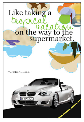
This piece, my Ride Promotional Poster shows proficiency in both Illustrator and Photoshop. Most elements of this layout were created in Illustrator. The car itself was a separate project, that was then integrated into this one. The car was built in Illustrator, taking lots of time but in the end, looking pretty good. For this project, I used many Illustrator tools including the pen tool, gradients, gradient meshes, and transparencies. Besides building the car in Illustrator, I built the tropical, beach images in the clouds to further the feeling of a tropical vacation. I think these tiny images are successful in this. Although the images are not as realistic as a photograph, they give an idealized picture of the beach, tropical getaways, and relaxation, which is their purpose. I used several tools in Illustrator to build them. Primarily, I used the pen tool to draw all the shapes I could, including shadows, highlights, etc. I also utilized the layers to keep them organized and to prevent me from getting confused.
The final cloud images were assembled in Photoshop, however. I imported the .ai files into photoshop, where I applied several effects to make the images slightly more realistic. For example, I used the blur tool to blend the wave breaks and used the burn tool to add dimension to the sandy beaches. I used the blur tool, the smudge tool, and the clone stamp to create the sunset seen in the cloud in the top right corner. After building the outlines of the clouds in Illustrator, I imported them as well into Photoshop and used them to create clipping paths and layer masks to condense the original Illustrator graphic into the desired shape. I then added another cloud outline as another layer on top to create the outlines of the clouds for a more defined edge.
Because of the range of skills and tools used in both Illustrator and Photoshop to build these graphics, I believe they are a good representation of my proficiency in both programs.
InDesign

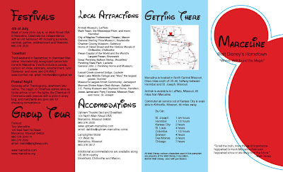
This pamphlet promoting the small town of Marceline, MO, hometown of Walt Disney, is the piece I've chosen to display my proficiency in InDesign. It successfully uses the principle tools of InDesign. First, it uses a grid system to create the four different panels. Also, each image or graphic has been built in Illustrator or prepared in Photoshop and then correctly imported into this document at the correct resolution and in the correct color mode. Another important element of InDesign is text, which I believe I used and arranged well. To make the process a little easier on myself, I used lots of character styles: one for the headers in the Waltograph typeface, one for the subheads, and one for the paragraphs of text. This made arranging and formatting the text much easier and faster. Another tool I used in this project was text wrap, which after a little adjusting and playing around with it, I think works well. Because this project required the use of the fundamental tools of InDesign, I believe it is a good example of my proficiency with this software.
4.24.2009
Dummy Disappointments
Today we turned in the printed, dummied pamphlet for Marceline, hometown of Walt Disney. However, I was disappointed with how mine turned out. The printing process went smoothly, and I was excited to put it together after seeing how well the individual pages printed out. It was going to look great! First thing, I spray mounted the two pages back-to-back. I think at this point I must not have lined them up exactly right. Because then, after carefully trimming off the bleeds (based on the inside spread), the outside looked a little off. Oh well, nothing I could do about it then. Much to my dismay, I then realized that because they were off by just a tiny fraction of an inch, the folds would not line up correctly. I had to choose, did I fold based on the inside spread or the outside? I chose the inside so that the copy would not get cut off by any of the folds. Later, however, after the deed had been done, I realized it would have been better to fold to the outside. The paper I used was probably too thick for a double-sided pamphlet as well, which added to the folding difficulties. Oh well, lessons learned for next time I guess...
Fishing Final Layout


This is my final layout for the fishing magazine spread. I think it turned out nicely. I was able to successfully manage the text, I think partially due to copy-fitting the given copy beforehand in creating the marker comp. That was exciting, to have it actually work! I made very few changes to the final layout from the marker comp. I think the only change was made in the header. I found that the headline was easier to read on the dark blue background if it was in white, but I also added a black stroke and a drop shadow to draw even more emphasis to the headline so that it would not blend into the photograph in the background. I also forgot to include the byline in the marker comp, so I added that into the final. My final pull quote was shorter than I anticipated in the comp, however, I believe this shorter quote works better with the layout and is worthy of being a pull quote. Overall, I think the design was successful and I am anxious to see how it prints out.
4.20.2009
Done A Little Early!


So I'm pretty excited that I got the production of the Marceline pamphlet done a few hours before I had expected to! I'm very pleased with how it turned out. I had a few issues trying to master the strokes around the Mickey graphics in illustrator. It took awhile to realize that just expanding the path around the graphic wasn't going to work for the strokes I wanted. I had to play with them a little in order to have a uniform distance all around. But overall, I'm very pleased with how it looks...on screen anyway. I checked, double-checked, and even triple -checked all my links to make sure they were all in the correct mode and resolution for a print document. Now I just have to send it off to the printer!
Fishing Comp


Many, many, many, many hours went into the final marker (or rather, colored pencil in this case) comp for the fishing magazine layout. I decided to use colored pencils so that I could be more precise in re-creating the photographs I had found to use for this project. This was the first time I had used them for a project, so I experimented a little before getting to work on the final project. Overall, I think the images look good. I think my favorite part is the fish coming up off the bottom corner on the second page of the spread.
I think the copy-fitting was pretty successful. However, after penciling in the paragraphs for 2/3 of the copy, I realized I had forgotten one of the subheads and had to start over to add it in. Shoot. Hopefully remembering details like that will come more naturally soon.
I am glad now that I realized before this comp that the photograph I had originally intended to use for the header was too small in resolution to use at the size I needed. Although I don't like this second photograph as well as the first, I think it will still look pretty good. The photograph of the fishing lures currently has a colored background, but I haven't decided if I want to include it in the background or C.O.B it. Maybe I'll experiment a little and see which looks better in the final production.
Subscribe to:
Posts (Atom)
