As early in the morning as it was, I sincerely liked taking DSP. I think I learned more design tips and tricks in this class than any other this semester. I learned my way around programs like Illustrator, Photoshop, and InDesign and how to incorporate different elements from each into one final project. I think the program I still need the most practice with is Photoshop, working with the different effects and masks. I am eager to learn more about the program, however, and I am looking forward to the soonest opportunity to do so. I have learned to enjoy importing graphics and text into an InDesign document, making sure they are all the right resolution and color mode, checking to make sure the type follows the basic typographic rules.
But in addition to learning some of the ins and outs of Adobe software, I learned how to be a designer. I learned that just knowing how to manipulate the software doesn't mean you know how to make a good design. It is the person that makes the design, not the computer. Thus, I learned how to do much of the designing process by hand: thumbnails, internal approval, marker comps, client presentation, and copy-fitting. Of these aspects, I think I need the most improvement in coming up with creative concepts and ideas quickly in the thumbnail stage. I think that this skill improved as the semester has progressed, but I am hoping to develop this skill even more in future VisCom courses. I can't wait!
5.01.2009
4.29.2009
Final Portfolio: Design Process
Best Thumbnails
I believe my best thumbnails were for the Marceline, MO pamphlet. Each mini, dummy-pamphlet shows a completely different concept. One explores the idea of Walt Disney going on to be world renowned for his movies and uses film strips as a motif. Another shows very little homage to Disney and emphasizes Marceline as a small-town, tourist attraction, providing a large map on the inside spread with each attraction pointed out and explained. One of my favorites shows an evolution of Mickey Mouse and a baseboard with a mouse hole on the front cover. The idea behind this design was to show that Disney grew up and matured out of Marceline, like Mickey Mouse grows and evolves over time. Another has a tourist theme, making all the photographs of the town's sights into postcards with the intention of drawing visitors. The fifth, and the design that was carried further into production, is the most colorful and uses a Mickey Mouse ears motif throughout. Although it was difficult at first to think up 5 completely different concepts and ideas, I think that each one could be carried out successfully.
Best Marker Comp
I believe my best marker comp was for the Marceline, MO pamphlet. I believe this shows successful copyfitting, design decisions, and is clean and neat. The first thing I did was copy-fit each paragraph of copy and cut out pieces of paper the correct size to trace onto the comp. This helped me arrange the paragraphs so they would fit in the layout and have a relatively uniform look. This process of making a marker comp forced me to make many design decisions ahead of time. For example, I had to decide what I wanted to do with subheads, how to arrange the paragraphs of copy, what images to use, etc. Also, I made smaller decisions about what size the margins should be, how big to make the gutter between the columns, and so on. By taking the time to make these decisions and carefully marking them out now, the final production of the pamphlet was completed quickly and successfully.
Best Traditional Copyfitting


It took awhile to get the hang of copyfitting at first. But eventually, I think I began to understand it more, making the process a little easier. The most successful copyfitting I did was for the Marceline pamphlet. At first I had some difficulties because I knew I wanted the copy for the Attractions to wrap around photographs. As we had not discussed how to do this in class, I experimented a little. Although some paragraphs are a little off, overall, my method was pretty successful. I was very glad that I did use traditional copyfitting, as it showed me how to arrange the paragraphs so that the inside spread would seem pretty uniform while still fitting in all the copy as well as the photographs I wanted. Copyfitting for the outside panel was a little more difficult because I knew the copy wasn't in paragraph form, but in lines. So I copyfit based on the number of lines instead of characters. Although this did not give a feel for how long each line would be, it did give a general idea of how long each list would be. Although the process was painstakingly tedious, I am glad that I went through it because I think it helped solve many problems that could have come up later and the layout is better overall as a result.
Best Design

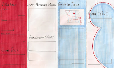
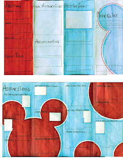
I believe my best design was for the Marceline, MO pamphlet. It shows a sense of hierarchy through the use of different text sizes and typefaces. For example, the headers -- telling the reader what the information he or she is about to read is concerning -- are a larger size and in the Waltograph typeface. Meanwhile, to show less importance and for the sake of legibility, the rest of the copy is in simple Helvetica. I distinguished the subheads, making them bold. This project is unified by using the same typefaces and styles throughout as well as keeping the same color scheme of red, white and blue. I chose this color scheme to give a sense of a patriotic small town. I also unified the piece by using the same Mickey Mouse motif throughout, although with some variations to add interest. A grid structure keeps it organized and legible. Overall, my target audience was young families with children. I believe that this fun, colorful layout would be successful in attracting such an audience and enticing them to visit the small town of Marceline, MO; hometown of Walt Disney.
Best Typography
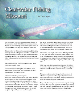
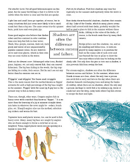
My best use of typography comes from the project which, ironically, was one of the easiest to set: the fishing magazine spread. In this spread I believe I successfully implemented a headline, byline, headers, subheads, and a pull quote. With a photograph behind the header and byline, I had to make sure that they were legible. I made the header text white with a black stroke to add emphasis and increase readability and added a drop shadow to add depth and definition between the text and background photo. I used simple black text for the byline so that it is readable but definitely less important and prominent than the header. Also, I positioned the text in a neutral area of the photograph so that the header and photo would not distract from each other. In addition, I payed careful attention to insure there were no widows or orphans in the body copy. I used a similar typeface as that of the header and byline to create unity but chose one with slightly easier readability for the larger blocks of copy. To distinguish headers from subheads, I made the headers bold while making the subheads italicized, never using both at the same time. I used text wrap around the pull quote and made sure that the images on the second page of the spread did not overlap and hide the text.
Best Concept
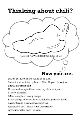
This project, a promotional poster for the National Ag Week 2009 Chili Cook-off was fun to think of ideas and concepts for. My goal was to create a poster that was interesting, with a concept that was a little different and made the viewer think. The idea behind the poster was to get people to enter their chili recipes for the cook-off. Now, most college students I know aren't usually thinking about cooking chili, chili cooking contests, or National Ag Week. So my task was to make them start thinking about it in the few seconds that they might glance at this poster. After playing around with several other concepts, I decided that the simplest way was the most obvious. Thus, the header "Thinking about chili?" to which the answer would of course be "No." But after being asked the question, the passerby then cannot help but be thinking about chili: "Now you are." In addition to meeting the goal of getting the viewer to consider chili, I think this concept comes across as slightly witty, or at least slightly entertaining. To further the idea of the viewer contemplating chili, I started the thought bubble at the word "you," emphasizing that is is the viewer's thought of chili and the National Ag Week 2009 Chili Cook-off that we are seeing, adding a personal aspect. Using a simple graphic of a chili pepper instead of a bowl of chili also helps with the straightforward, obvious approach I decided to take with this project.


I believe my best thumbnails were for the Marceline, MO pamphlet. Each mini, dummy-pamphlet shows a completely different concept. One explores the idea of Walt Disney going on to be world renowned for his movies and uses film strips as a motif. Another shows very little homage to Disney and emphasizes Marceline as a small-town, tourist attraction, providing a large map on the inside spread with each attraction pointed out and explained. One of my favorites shows an evolution of Mickey Mouse and a baseboard with a mouse hole on the front cover. The idea behind this design was to show that Disney grew up and matured out of Marceline, like Mickey Mouse grows and evolves over time. Another has a tourist theme, making all the photographs of the town's sights into postcards with the intention of drawing visitors. The fifth, and the design that was carried further into production, is the most colorful and uses a Mickey Mouse ears motif throughout. Although it was difficult at first to think up 5 completely different concepts and ideas, I think that each one could be carried out successfully.
Best Marker Comp


I believe my best marker comp was for the Marceline, MO pamphlet. I believe this shows successful copyfitting, design decisions, and is clean and neat. The first thing I did was copy-fit each paragraph of copy and cut out pieces of paper the correct size to trace onto the comp. This helped me arrange the paragraphs so they would fit in the layout and have a relatively uniform look. This process of making a marker comp forced me to make many design decisions ahead of time. For example, I had to decide what I wanted to do with subheads, how to arrange the paragraphs of copy, what images to use, etc. Also, I made smaller decisions about what size the margins should be, how big to make the gutter between the columns, and so on. By taking the time to make these decisions and carefully marking them out now, the final production of the pamphlet was completed quickly and successfully.
Best Traditional Copyfitting


It took awhile to get the hang of copyfitting at first. But eventually, I think I began to understand it more, making the process a little easier. The most successful copyfitting I did was for the Marceline pamphlet. At first I had some difficulties because I knew I wanted the copy for the Attractions to wrap around photographs. As we had not discussed how to do this in class, I experimented a little. Although some paragraphs are a little off, overall, my method was pretty successful. I was very glad that I did use traditional copyfitting, as it showed me how to arrange the paragraphs so that the inside spread would seem pretty uniform while still fitting in all the copy as well as the photographs I wanted. Copyfitting for the outside panel was a little more difficult because I knew the copy wasn't in paragraph form, but in lines. So I copyfit based on the number of lines instead of characters. Although this did not give a feel for how long each line would be, it did give a general idea of how long each list would be. Although the process was painstakingly tedious, I am glad that I went through it because I think it helped solve many problems that could have come up later and the layout is better overall as a result.
Best Design


I believe my best design was for the Marceline, MO pamphlet. It shows a sense of hierarchy through the use of different text sizes and typefaces. For example, the headers -- telling the reader what the information he or she is about to read is concerning -- are a larger size and in the Waltograph typeface. Meanwhile, to show less importance and for the sake of legibility, the rest of the copy is in simple Helvetica. I distinguished the subheads, making them bold. This project is unified by using the same typefaces and styles throughout as well as keeping the same color scheme of red, white and blue. I chose this color scheme to give a sense of a patriotic small town. I also unified the piece by using the same Mickey Mouse motif throughout, although with some variations to add interest. A grid structure keeps it organized and legible. Overall, my target audience was young families with children. I believe that this fun, colorful layout would be successful in attracting such an audience and enticing them to visit the small town of Marceline, MO; hometown of Walt Disney.
Best Typography


My best use of typography comes from the project which, ironically, was one of the easiest to set: the fishing magazine spread. In this spread I believe I successfully implemented a headline, byline, headers, subheads, and a pull quote. With a photograph behind the header and byline, I had to make sure that they were legible. I made the header text white with a black stroke to add emphasis and increase readability and added a drop shadow to add depth and definition between the text and background photo. I used simple black text for the byline so that it is readable but definitely less important and prominent than the header. Also, I positioned the text in a neutral area of the photograph so that the header and photo would not distract from each other. In addition, I payed careful attention to insure there were no widows or orphans in the body copy. I used a similar typeface as that of the header and byline to create unity but chose one with slightly easier readability for the larger blocks of copy. To distinguish headers from subheads, I made the headers bold while making the subheads italicized, never using both at the same time. I used text wrap around the pull quote and made sure that the images on the second page of the spread did not overlap and hide the text.
Best Concept

This project, a promotional poster for the National Ag Week 2009 Chili Cook-off was fun to think of ideas and concepts for. My goal was to create a poster that was interesting, with a concept that was a little different and made the viewer think. The idea behind the poster was to get people to enter their chili recipes for the cook-off. Now, most college students I know aren't usually thinking about cooking chili, chili cooking contests, or National Ag Week. So my task was to make them start thinking about it in the few seconds that they might glance at this poster. After playing around with several other concepts, I decided that the simplest way was the most obvious. Thus, the header "Thinking about chili?" to which the answer would of course be "No." But after being asked the question, the passerby then cannot help but be thinking about chili: "Now you are." In addition to meeting the goal of getting the viewer to consider chili, I think this concept comes across as slightly witty, or at least slightly entertaining. To further the idea of the viewer contemplating chili, I started the thought bubble at the word "you," emphasizing that is is the viewer's thought of chili and the National Ag Week 2009 Chili Cook-off that we are seeing, adding a personal aspect. Using a simple graphic of a chili pepper instead of a bowl of chili also helps with the straightforward, obvious approach I decided to take with this project.
Final Portfolio: software proficiency
Illustrator & Photoshop
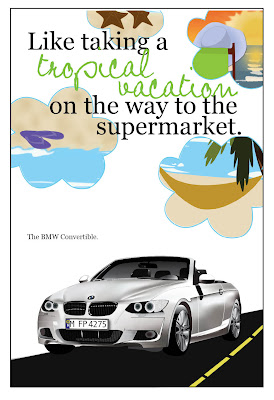
This piece, my Ride Promotional Poster shows proficiency in both Illustrator and Photoshop. Most elements of this layout were created in Illustrator. The car itself was a separate project, that was then integrated into this one. The car was built in Illustrator, taking lots of time but in the end, looking pretty good. For this project, I used many Illustrator tools including the pen tool, gradients, gradient meshes, and transparencies. Besides building the car in Illustrator, I built the tropical, beach images in the clouds to further the feeling of a tropical vacation. I think these tiny images are successful in this. Although the images are not as realistic as a photograph, they give an idealized picture of the beach, tropical getaways, and relaxation, which is their purpose. I used several tools in Illustrator to build them. Primarily, I used the pen tool to draw all the shapes I could, including shadows, highlights, etc. I also utilized the layers to keep them organized and to prevent me from getting confused.
The final cloud images were assembled in Photoshop, however. I imported the .ai files into photoshop, where I applied several effects to make the images slightly more realistic. For example, I used the blur tool to blend the wave breaks and used the burn tool to add dimension to the sandy beaches. I used the blur tool, the smudge tool, and the clone stamp to create the sunset seen in the cloud in the top right corner. After building the outlines of the clouds in Illustrator, I imported them as well into Photoshop and used them to create clipping paths and layer masks to condense the original Illustrator graphic into the desired shape. I then added another cloud outline as another layer on top to create the outlines of the clouds for a more defined edge.
Because of the range of skills and tools used in both Illustrator and Photoshop to build these graphics, I believe they are a good representation of my proficiency in both programs.
InDesign

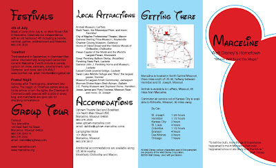
This pamphlet promoting the small town of Marceline, MO, hometown of Walt Disney, is the piece I've chosen to display my proficiency in InDesign. It successfully uses the principle tools of InDesign. First, it uses a grid system to create the four different panels. Also, each image or graphic has been built in Illustrator or prepared in Photoshop and then correctly imported into this document at the correct resolution and in the correct color mode. Another important element of InDesign is text, which I believe I used and arranged well. To make the process a little easier on myself, I used lots of character styles: one for the headers in the Waltograph typeface, one for the subheads, and one for the paragraphs of text. This made arranging and formatting the text much easier and faster. Another tool I used in this project was text wrap, which after a little adjusting and playing around with it, I think works well. Because this project required the use of the fundamental tools of InDesign, I believe it is a good example of my proficiency with this software.
4.24.2009
Dummy Disappointments
Today we turned in the printed, dummied pamphlet for Marceline, hometown of Walt Disney. However, I was disappointed with how mine turned out. The printing process went smoothly, and I was excited to put it together after seeing how well the individual pages printed out. It was going to look great! First thing, I spray mounted the two pages back-to-back. I think at this point I must not have lined them up exactly right. Because then, after carefully trimming off the bleeds (based on the inside spread), the outside looked a little off. Oh well, nothing I could do about it then. Much to my dismay, I then realized that because they were off by just a tiny fraction of an inch, the folds would not line up correctly. I had to choose, did I fold based on the inside spread or the outside? I chose the inside so that the copy would not get cut off by any of the folds. Later, however, after the deed had been done, I realized it would have been better to fold to the outside. The paper I used was probably too thick for a double-sided pamphlet as well, which added to the folding difficulties. Oh well, lessons learned for next time I guess...
Fishing Final Layout


This is my final layout for the fishing magazine spread. I think it turned out nicely. I was able to successfully manage the text, I think partially due to copy-fitting the given copy beforehand in creating the marker comp. That was exciting, to have it actually work! I made very few changes to the final layout from the marker comp. I think the only change was made in the header. I found that the headline was easier to read on the dark blue background if it was in white, but I also added a black stroke and a drop shadow to draw even more emphasis to the headline so that it would not blend into the photograph in the background. I also forgot to include the byline in the marker comp, so I added that into the final. My final pull quote was shorter than I anticipated in the comp, however, I believe this shorter quote works better with the layout and is worthy of being a pull quote. Overall, I think the design was successful and I am anxious to see how it prints out.
4.20.2009
Done A Little Early!


So I'm pretty excited that I got the production of the Marceline pamphlet done a few hours before I had expected to! I'm very pleased with how it turned out. I had a few issues trying to master the strokes around the Mickey graphics in illustrator. It took awhile to realize that just expanding the path around the graphic wasn't going to work for the strokes I wanted. I had to play with them a little in order to have a uniform distance all around. But overall, I'm very pleased with how it looks...on screen anyway. I checked, double-checked, and even triple -checked all my links to make sure they were all in the correct mode and resolution for a print document. Now I just have to send it off to the printer!
Fishing Comp


Many, many, many, many hours went into the final marker (or rather, colored pencil in this case) comp for the fishing magazine layout. I decided to use colored pencils so that I could be more precise in re-creating the photographs I had found to use for this project. This was the first time I had used them for a project, so I experimented a little before getting to work on the final project. Overall, I think the images look good. I think my favorite part is the fish coming up off the bottom corner on the second page of the spread.
I think the copy-fitting was pretty successful. However, after penciling in the paragraphs for 2/3 of the copy, I realized I had forgotten one of the subheads and had to start over to add it in. Shoot. Hopefully remembering details like that will come more naturally soon.
I am glad now that I realized before this comp that the photograph I had originally intended to use for the header was too small in resolution to use at the size I needed. Although I don't like this second photograph as well as the first, I think it will still look pretty good. The photograph of the fishing lures currently has a colored background, but I haven't decided if I want to include it in the background or C.O.B it. Maybe I'll experiment a little and see which looks better in the final production.
Presentation
In class on Wednesday, we presented our dummied marker comps for the Marceline pamphlet to the other lab, such as we would to a client. I wasn't too intimidated by the presentation or having things to say, but I was surprised at how short a time it took to present everything I had planned. Guess that's a skill to work on, taking up enough time in the presentation. However, I don't think this will be too difficult. As soon as I finished presenting my layout and the next person had started, of course I thought of more I could have said. Of course...
4.15.2009
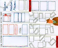
Marceline Marker Comp

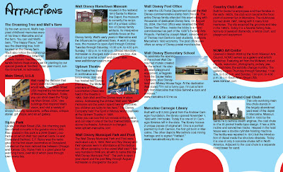
My goal with this project was to target an audience of families with young children who, like most kids, are interested in Disney movies. The idea behind this brochure then was to catch their eye and attract these young families to Marceline, MO. Having younger siblings as well as (like most people) once being a kid myself (maybe I still am...) I know that the bright colors and the big, bold, iconic Mickey Mouse graphic would grab the attention of most little kids, who would take the brochure to their parents and beg to go there. Bingo. Goal accomplished.
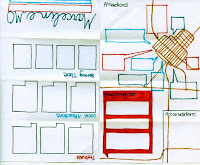
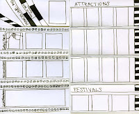
However, this brochure is attractive to the parents who can read, unlike their small children only interested in the pretty pictures. I wanted to keep the layout simple so that busy parents can find the information they want quickly. The typeface used for the headers clearly identifies with Walt Disney, in case the Mickey ears weren't enough. There is also a hierarchy shown in the way the pamphlet is opened. First, the reader sees some of the Attractions, as well as Local Attractions and Accomodations. This tells the reader why he should come to Marceline. The next panel opened tells about the special Festivals that take place in Marceline as well as information on a Group Tour. Finally, after being convinced that Marceline, MO is his next vacation destination, the reader flips to the back, where he is told how to get there.
A few notes on the construction: The white rectangles are placeholders for photographs or a map on the "Getting There" panel. The "Local Attractions/Accomodations" panel has no photographs. Because the blocks of copy on that panel will be more like lists than paragraphs, I copy-fitted for the number of lines I knew would be there, not necessarily how long each line will be. I am excited to move this pamphlet into final production and see the end result.
4.10.2009
Fishing Thumbnails

I thought that this project was interesting: design a layout targeting and audience of the opposite sex. Personally, I don't know many guys that are too big on fishing, but I still had fun researching something a little different. For this layout, I found some really great photography to incorporate. I especially like the photo used as a background for the header in the first thumbnail. My tiny marker comp of it does not do it justice. But I really think it will look good. That is the design that will be carried further into production -- next with a marker comp, then the final production using the software. Another feature of this design that my classmate Danielle liked was the pull quote on the second page. She also liked that about the thumbnail right under the final one.
I really liked the fish illustration I found, so it is incorporated in several of the layouts. Also, I liked experimenting with blocks of color to break up the page. I did a tiny bit of preliminary copy-fitting, and I believe that the copy would fit nicely into all of these layouts, and will look great in the one I will be carrying on to completion.
4.08.2009
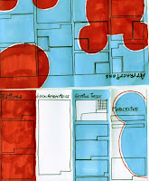
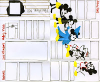
Mickey Marceline
These are the color thumbnail comps I created for the pamphlet featuring the small town of Marceline, MO, the childhood home of Walt Disney. I had a different concept for each.

thumbnail 1
For thumbnail 1, I wanted to show that Disney's idea of Mickey Mouse grew out of Marceline. Therefore the front panel shows a hole in a baseboard, such as a mouse might live in. The inside spread shows the growing up, or evolution of Mickey Mouse, showing that Disney grew up in Marceline.

thumbnail 2
In this design, I wanted to portray the idea of Marceline as a destination with small-town-America charm. I used postcards to portray this. Each postcard was to present a different image of the attractions of Marceline. The red, white, and blue color scheme further promotes the idea of a small, patriotic town. The man featured on the inside spread represents a photograph of Walt Disney himself.

thumbnail 3
This concept shows Disney's original trademark: film. Each block of copy is shown as a portion of a film strip. I used only black and white to keep the layout simple and unconfused.

thumbnail 4
This design mimics a map of the Disneyland theme parks. The inside spread features a map of Marceline, with callouts describing each attraction while also pointing out its location. Again, a patriotic color scheme was utilized to emphasize the small-town-America feel.

thumbnail 5
This is the design that, after discussion with my classmate Danielle, I have decided to carry further into production. I chose this one because it is simple, but eye-catching and appealing. It utilizes a silhouette of the classic Mickey Mouse ears as a motif throughout. My goal in this layout was to appeal to young families who might have children interested in Disney.
Final Ride Promotion Poster

The biggest issue I had when completing the final stages of production was time. Or rather, the lack thereof. I had forgotten that I would have to build the extra graphics featured in the clouds. I constructed these in Illustrator, then exported them to Photoshop to apply clipping paths in the cloud shape before finally placing them in my InDesign document. These took about 3-4 hours. It also took me awhile to figure out how to use the clipping paths and layer masks to the best advantage. However, overall I believe I was successful and ended up with a good design.
The only problem I had with presentation was the realization that I did not have a piece of black foam core that was big enough for mounting the 13x19" final poster. This was easily remedied with a quick run to Walmart and the evening, and the project, was saved.
4.05.2009
Ride Promotion Poster Comp

I made several significant changes from my original thumbnail design for this half-size, full color marker comp. Most of these changes were suggestions made by Erin when choosing the design that I would carry further into production. She suggested adding small, tropical images into the cloud shapes to further the concept of a tropical vacation. I have added graphics of flip-flops, a hammock and a palm tree, a person watching the sunset on the beach, and small sea creatures in the tide. I plan to create these graphics in Illustrator and Photoshop.
Creating this comp was different in several ways. First, it was in color, which I found harder to work with. Because my car illustration that I had to work with already existed, some colors were chosen for me. The car I had previously created is silver, but because I did not have a silver or gray marker, I used a light blue to represent the silver car. Because color was more difficult to work with, I was very glad that this comp was only half-size, therefore taking much less time than it otherwise would have!
3.27.2009
Chili Cook-off part 2


This is the design I have been working on for the Chili Cook-off poster assignment. The image on the left, my original thumbnail, was edited in several ways before moving on to the full size marker comp on the right (apologies for the poor scan). I added a little more detail to the chili graphic by varying the line weights and adding highlights along the chili as well as the stem. The headline "Thinking about chili?" was changed so that it fit on one line instead of the two. Also, the "N" in "now you are." was capitalized to keep the composition unified. For the marker comp, I was able to add in the text in the larger block. Once I saw how much text there actually would be, I was able to increase the font size and the leading slightly for an airier, easier-to-read look. For the marker comp, I also used an exact typeface instead of the general idea of one I used for the thumbnail.

From the discussion of the marker comps, I received several good suggestions that I am integrating into the final design. I altered the graphic again, adding a thought bubble behind the chili and lowering its opacity so it will not distract from the chili. I also gave more emphasis to the event title itself by rearranging the text "National Ag Week 2009 Chili Cook-off" and moving it under the chili graphic, inside the thought bubble.
"Ride" Promotion Poster Thumbnails


For this project, I decided to advertise the car itself, a BMW convertible. My target audience was wealthy, upper-class women. Therefore, I wanted to portray the car as luxurious and elegant. To do this, I used rich colors like purples and fonts that would give the words an elegant, special feel.

Of the ten thumbnails I originally made, this is the design that will be carried on into further production. It was chosen for several reasons. First, this design has the most interesting concept. I liked the idea of a get-away during the otherwise hectic day. Also, my classmate, Erin, liked the contrasting fonts, which emphasizes the idea of a tropical escape. She thought the colors used lead to this concept as well. She also provided several helpful suggestions for improvements or ideas to experiment with when taking this design further into production. I thought she had some really good, insightful ideas and I am eager to experiment with them and see how they could turn out.
3.20.2009
Chili Cook-off

I believe that the concept behind this design was the idea of a cook-off itself, or a competition. This idea is seen in the image, which shows several ingredients for chili on a winner's stand. The hierarchy shown in the image is also applied to the layout itself. Through an excellent use of positive and negative space, the header "CHILI COOK OFF" is clearly emphasized and the focus of attention. From there, the viewer sees the appealing and slightly whimsical graphic, then the event details outlined below. The layout also uses an approximately 4-column grid, which provides balance and stability. Also important is the fact that this sketch follows the project specs: 11"x17", one color (black), and no bleed. The only suggestions I would have for improvement are to shift the words "Chili" and "Cook" in the header so that they match up with the grid structure better. Perhaps the image needs to be moved slightly as well for the same reasons. However, I do like the column of empty space on the left side of the poster. Overall, this design is eye-catching, appealing, and slightly whimsical.
3.19.2009
Copyfitting
Here's the copyfitting process I've read about on this website:
step 1. Get out a pencil and scrap paper to write out the upcoming measurements and calculations--your head will thank you later.
step 2. Get a character count. In other words, count each letter, number, symbol, space and punctuation mark of the copy.
step 3. Look up the Character per pica (CPP) measurement, which is based on the typeface being used and the alphabet length.
step 4. Multiply the CPP by the line length. This will tell you how many characters will fit in one line of copy.
step 5. Divide the character count found at the beginning by the number of characters that fit in one line (the number found in the last step). This will tell you the total number of lines the given copy will take up.
step 6. Multiply that number by the leading to get the copy depth.
step 7. If the project is mostly text, divide the total number of lines (found in step 5) by the number of lines per page desired to get the number of pages the copy will take up. However, if there are headers, subheaders, or illustrations, this number will have to be changed slightly.
Now aren't you glad you got out that scrap paper?
Helvetica Controversy
Helvetica. It looks so clean-cut and simple. But as this documentary shows, not all designers agree. Some say that the font we see everywhere on the street is perfect; it can look good anywhere. But other designers find it boring and overused. Personally, I am pro-Helvetica. I like the easy simplicity it has and the fact that it is so versatile. A truly good, skilled designer can make even a "boring" font look appealing and eye-catching.
Overall, I thought the "Helvetica" documentary was very interesting. I never would have guessed that there is so much going on behind every font. A creator, a history, fans, opponents, etc. It left me wanting to learn more about typography. Now I'm eager to experiment with different fonts and the emotions they can evoke.
Overall, I thought the "Helvetica" documentary was very interesting. I never would have guessed that there is so much going on behind every font. A creator, a history, fans, opponents, etc. It left me wanting to learn more about typography. Now I'm eager to experiment with different fonts and the emotions they can evoke.
3.06.2009
Midterm Portfolio: Photoshop

Photo Composite
This project taught me some of the fundamentals of working in Photoshop. Who ever would have thought that there were so many steps involved in simply scanning in an image? Not I! Nevertheless, this composite taught me the ins and outs of scanning different types of images, how to edit image color modes, and refined my knowledge of making selections in Photoshop. From the original, I have made very few changes. I added a multiply layer effect to the rabbit to drop out the remaining white fills and smoothed the edge of the two girls in the bottom left by using the blur tool. This exercise gave me some of the foundational skills I would use in later projects.

Photo Retouch
I got to use my new scanning expertise for this second exercise in Photoshop in which I scanned and retouched a damaged photo. This project taught me the second main purpose of Photoshop: photo retouching and effects. The original photo, on the left, suffered from damage from age and creases in the top corner. Using selections and the clone tool, these blemishes were easily erased.
3.04.2009
Midterm Portfolio: InDesign

Magazine Spread Rebuild
At first, I thought this project would be easy, a no-brainer. Scan in some images, type up the copy, put them together, and Tada! But very soon I saw that I was very wrong! Troubleshooting a scanner that was acting up was the first of my troubles. There, finally! The images were scanned into Photoshop and saved as .tiff files. Now, just type up the copy, flow it through 4 columns, and I’m done! Little did I know…Trying to find matching fonts was easy compared to trying to deconstruct the settings the original designer had set for the type. Leading, kerning, tracking…what did all this mean? As I experimented, I finally got a feel for what each of these typesetting terms meant and how changing each specifically altered the block of copy. In addition for starting to give me an understanding of typography, this project gave me a deep respect for the typesetters whose work I have so long taken for granted! From the original, I cleaned up my links: changing some from RGB to CMYK mode, cleaning up the backgrounds, and making sure they were all .tiff files before finally re-linking them.
Midterm Portfolio: Illustrator

US Eagle Symbol
This project was one of many that taught me and refined my skills with the pen tool in Illustrator. I chose this exercise as an example of this because it was while working on this project that the principles and ideas behind using this small but mighty tool finally started taking shape and making sense. I feel that this is the project with which I finally grasped all the ideas I had been hearing for weeks. Closed paths, strokes, Bezier curves, time saving tricks like drawing only half of the symmetric eagle and then flipping and joining the two halves to form the whole. Finally this all made sense! From the original, I added an effect to the circles surrounding the cluster of stars to give them a different look. Also, I changed the color of the branch stem in the eagle’s foot and refined the background gradient.

"My Favorite Ride"
The “My Favorite Ride” project was the true test of my knowledge of the pen tool! This project also required careful attention to layers and effects, such as the gradient mesh tool and transparencies. While experimenting to find just the right effect grew frustrating and time consuming, the end result made me proud of all the hours I poured into it. I was able to use the skills with the pen tool I had acquired from previous exercises such as the eagle symbol. But I was also able to play around with new techniques and effects such as feathering shapes, using transparencies, and creating subtle gradients to give the car the illusion of being 3-D. The “Ride” project was also my first introduction to large-format printing, which turned out to be much less frightening than it originally seemed. After turning in this exercise, I made several changes. I added a reflection to the left grill and added a connecting piece between the side mirror and the frame of the windshield. Also, I darkened the wells behind the tires and adjusted the bottom edges of the tires on the driver’s side, making them more realistically shaped.
3.01.2009
Don't Flip That Page!

the original layout

my rebuilt layout
The first time I flipped through my February InStyle magazine, I almost skipped over this article, lazily eager to move on to spreads with bigger, more appealing photos of fabulous clothes. However, just as I was about to turn the page, the pullout quote on the second page (located right above the spot where my fingers were as I nearly flipped the page) grabbed my attention. A good move on the part of the designer, I must say. And even though I found thought of Tabasco-sauce-themed ties somewhat discomforting, I was intrigued and turned my attention back to the first page to read the article, which proved to be entertaining after all.
It turns out that the schematically placed pullout quote isn’t the only good decision the designer made. The four-column layout is balanced and visually attractive. The designer also skillfully controlled the reader’s eye movement. For example, I was first attracted to the quote, then the illustration under the quote, which then shifted my view to the similar illustration on the first page, leaving me at the top of the article, ready to read. The layout has a uniform theme. It repeats two fonts throughout the different text elements. The colors are also repeated in both text and illustrations. The designer also gave the article a casual feel with the use of sketchy illustrations and small details along the spine and edges of the pages that look like the edges and binding of a notebook.
The designer also dealt with the large amount of copy well. The use of a serif font makes it easy to read, as does the dark, contrasting text color. Although the text is justified, there are no large spacing gaps or over-hyphenation, making the text more visually appealing. The drop cap was used correctly: only in the first paragraph of the article to help draw the reader into the story. So although I was initially apt to skip this article, its visual appeal drew me in and made me read what proved to be an amusing story.
Subscribe to:
Posts (Atom)
